Negativraum im Design
Management Summary
Negativraum kann dazu beitragen, die Botschaft Ihres Logos oder Ihrer Werbung zu vermitteln. Nutzen Sie dieses subtile, aber kraftvolle Mittel, um Ihre Designs auf die nächste Ebene zu heben. In diesem Artikel werden Ihnen die verschiedenen Methoden des Negativraums vorgestellt und gezeigt, wie Sie ihn am besten zu Ihrem Vorteil einsetzen können.
Den Negativraum verstehen
Negativraum, auch als Weißraum bekannt, ist der Bereich, der die primären Elemente eines Designs umgibt und trennt. Seine subtile Präsenz sorgt für visuelle Klarheit und ermöglicht es dem Betrachter, sich auf die wesentlichen Aspekte zu konzentrieren, ohne abgelenkt zu werden.
Die Kraft der Einfachheit
Einfachheit, bewusst umgesetzt, ist ein mächtiges Designprinzip. Negativraum reduziert visuelles Rauschen, bietet dem Publikum eine Pause und erhöht das allgemeine Verständnis. Ein herausragendes Beispiel ist das FedEx-Logo, bei dem der strategisch platzierte Pfeil Fortschritt und Bewegung symbolisiert und damit die Wirksamkeit von Einfachheit in der Botschaftskommunikation zeigt.
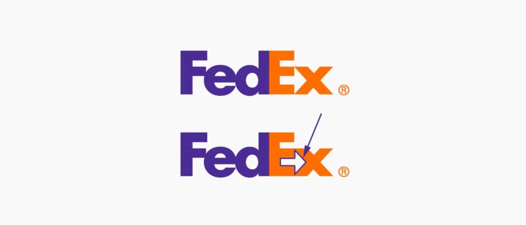
FedEx Logo, Quelle: FedEx
Die Aufmerksamkeit des Betrachters lenken
Negativraum ist ein stiller Wegweiser, der die Aufmerksamkeit des Betrachters durch eine visuelle Reise leitet, ohne dass dies explizit vorgegeben wird. Ein Beispiel ist das Amazon-Logo, bei dem der Pfeil, gebildet durch den Negativraum zwischen dem „A“ und „Z“, subtil die große Produktvielfalt kommuniziert. Dieser subtile Richtungsindikator zeigt die strategische Nutzung von Negativraum zur Vermittlung einer Markenbotschaft.

Amazon Logo, Quelle: Amazon
Visuelle Wirkung verstärken
Weniger Unordnung führt oft zu mehr Wirkung. Durch das Entschlacken eines Designs und die gezielte Nutzung von Negativraum werden die wesentlichen Elemente hervorgehoben, wodurch die Botschaft visuell überzeugender wird. Googles minimalistische Startseite, geprägt von großzügigem Negativraum, ist ein Beispiel für diesen Ansatz und sorgt für eine unaufdringliche, benutzerfreundliche visuelle Erfahrung.
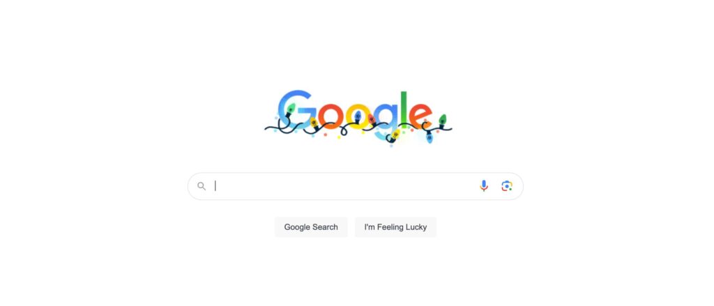
Google Startseite, Quelle: Google
Balance im Design erreichen
Balance ist ein grundlegendes Designprinzip, und Negativraum spielt eine entscheidende Rolle bei der Erreichung von Gleichgewicht. Er verhindert visuelle Unausgewogenheit und ermöglicht es jedem Element, harmonisch zu bestehen. Das WWF-Logo, das einen Panda mit viel Negativraum zeigt, demonstriert dieses feine Gleichgewicht und lenkt die Aufmerksamkeit auf die bedrohte Tierart, während die visuelle Harmonie erhalten bleibt.

WWF Logo, Quelle: WWF
Praktische Strategien für den effektiven Einsatz von Negativraum
Bewusste Freiräume nutzen: Betrachten Sie Negativraum als gezielten Freiraum, nicht als leere Fläche. Er trägt zu visueller Kohärenz und Eleganz bei.
Wichtige Botschaften hervorheben: Nutzen Sie Negativraum, um entscheidende Botschaften zu betonen. Stellen Sie sicher, dass Ihre Designelemente das Content ergänzen, anstatt mit ihm zu konkurrieren.
Gezielt experimentieren: Design ist ein iterativer Prozess. Experimentieren Sie bewusst mit Negativraum und finden Sie das optimale Gleichgewicht, das Ihre Designziele unterstützt.
Einfachheit als Design-Tugend: Akzeptieren Sie das Prinzip, dass Einfachheit eine Tugend im Design ist. Ein zurückhaltendes, aufgeräumtes Design kommuniziert oft effektiver als eine übermäßig komplexe Variante.
Fazit
Negativraum, präzise und bewusst eingesetzt, verwandelt visuelle Elemente in eine Sprache, die nahtlos kommuniziert. Weit davon entfernt, eine bloße Abwesenheit zu sein, ist er eine bewusste Entscheidung, die Design aufwertet und für Klarheit, Fokus und dauerhafte ästhetische Wirkung sorgt. Als Designer ermöglicht uns das Erkennen der Feinheiten und Potenziale von Negativraum, visuelle Arbeiten zu schaffen, die wirken und Bestand haben.