5 Steps To The Perfect Data Studio Design

Management Summary
Tip 1: Check requirements
First, you should consider what the Data Studio Dashboard will be used for in the future. It is primarily used digitally and can therefore be used withinteractive toolsbe equipped? Or is it regularly sent as a PDF by email and then printed out by the recipient?
The answers to these questions decide whether betterPortrait or landscape formatshould be used. If the dashboard is printed rather is a dark onebackgroundunfavorable.
When considering the requirements for the dashboard, the target group should not be forgotten. Do the people who will later use the dashboard already have experience with Data Studio Reports? Do you know the interactive tools and filter options? Or areNotes and explanationHelpful with the individual diagrams so that the dashboard can be used to its full extent?
Tip 1: Check requirements
Existing collections can be adapted just as easily. To do this, for example, click on “Edit Collection” in the “Life cycle” collection and you will be taken to the same editing menu. In the following screenshot, we have completely removed the monetization area for demonstration purposes and adjusted the order of the topics within the “Life cycle” collection.
Tip 2: Provide information
First of all, the readers/users of the dashboard need information about what data is involved. To do this, create a header that contains the following standard information:
- logo
- Title of the page
- Date filter
- Info about which comparison period was chosen for the diagrams
- Additionally, if relevant:
- more filters
- Info about which segment or campaign is being analyzed
To ensure that the header is displayed directly on all pages of the dashboard, the individual elements can be changed to report level by right-clicking.

Tip 3: Use colors
A bit of color is also a must in the Data Studio dashboard. On the one hand, if used correctly, it helps with data interpretation, but on the other hand, the dashboard should also fit the brand or campaign.
That is, thatDashboard designshould best be adapted to the corporate design or campaign subject. These settings can be made for the entire report under the menu item “Design and Layout” and you do not have to design each page individually. Font, font size, background and much more can be set here.
If you are still a bit confused about what the dashboard should look like, you can use the new feature “Extract design from image” Try it out. Simply upload the campaign subject or logo or paste it as a URL and Data Studio will generate a few design suggestions that can be adopted directly. Here you can see an example in which the design was created based on the Google logo.
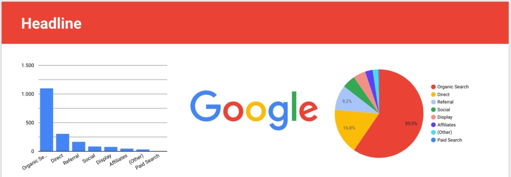
Colors are also intended to help with data interpretation. Specific colors can be stored for the dimension values under the menu item “Design and Layout”. This means that the respective values in the diagrams are always assigned the same color. In other words: the medium “cpc” is shown blue in all pie charts, “organic” is always red, “email” is always yellow – if you look at the example below.
Tip 4: Choose a suitable diagram shape
Next up is the main part of the dashboard – that’s right, the diagrams.
It is important to note that theappropriate diagram formis chosen for the respective question and data structure. To help, we recommend so-calledCheat sheets, like this one fromtotaldatascience.com.
In addition to the standard chart shapes in Data Studio, there are also theCommunity visualizations. Here you will find very useful displays, such as funnels, animated bar charts, Gantt charts, star ratings and much more. You can find detailed information on how you can use these community visualizations in ourBlog article on the topic “The new Data Studio “Community Visualizations”: A feature with superpower”
Once the appropriate display format has been chosen, don’t forget to make adjustments such as decimal places, heatmaps, in the “Style” tab.conditional formatting, labels etc. to be inserted where necessary. These settings are intended to help users interpret data.
Tip 5: Keep things organized
Since a Data Studio dashboard can display many different diagrams on one page, it is important to keep things organized. Because this is the only way readers can relate to theInterpretation of the datafocus.
The new management lines are particularly helpful in this regard. These are automatically activated and, when moving a diagram, show whether it is, for example, at the same height as another element or has the same height and width. In this way, distances can be maintained evenly and the different elements can be brought into order.
In general, make sure that the individual pages are not too overloaded and that there is some space between the images.
Our extra tip:
When your dashboard is finished, let it rest for a few days and then look at it again with a fresh eye to see whether it is understandable to people who are seeing it for the first time. Gladly here tooConsult colleaguesand ask for feedback.
And of course don’t forget: validate data!