The New Data Studio Community Visualizations A Feature With Superpower

Management Summary
For web analysts and marketers, data is like the star cast in a blockbuster. However, ordinary mortals are usually much less familiar with Excel sheets and numerical tables. In order to tell a compelling story with our data, we should give it a face.
Help us hereGoogle Data Studio. It conjures up pretty graphics from our piles of numbers that provide valuable insights at first glance. Numerous charts can be dragged and dropped onto a dashboard with a data source such as: B. Link and customize Google Analytics. For example, tables, pie charts, scorecards, various diagrams or geo maps are available.
But Data Studio does not always have the necessary chart ready for all the desired visualizations. That’s why Google has now added a feature that offers us almost unlimited possibilities:The Community Visualizations.
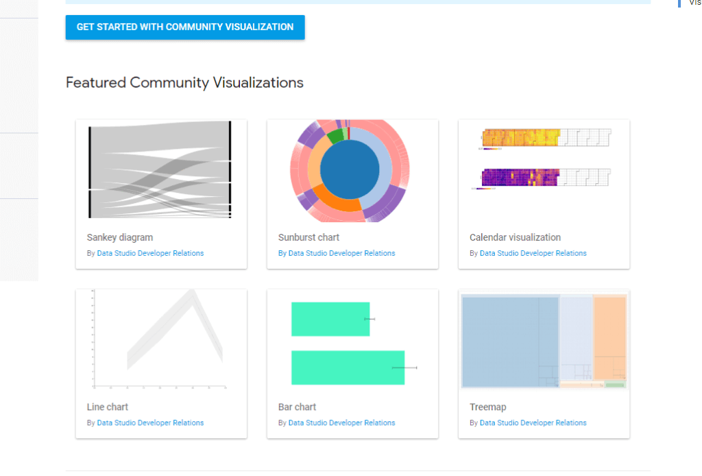
With the Community Visualizations, Data Studio provides a developer platform on whichown chartsbuild and with otherssplitlet. Data Studio itself only offers a small selection so farshowcasesavailable, which will hopefully be followed by many more soon.
Data security and activation
But don’t I leave my data to any developer? No. Data Studio applies to all community visualizationsContent Security Policyto. This protects the data from access by third parties. Still, the community needs visualizationsactivated individually for each data sourcebecome. Only then can this data source be linked to a community visualization.
So we activate this feature in the settings of the respective data source and switch “Community Visualizations Access” to “ON” in the menu bar at the top.

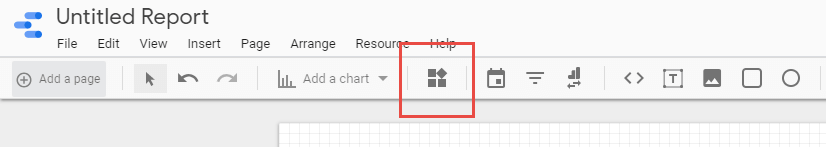
Use like standard charts
Once activated, the community visualizations can be integrated into our dashboard in a similar way to standard charts. ThebuttonYou can find “Add a chart” right next to the well-known dropdown.
We will then after thatComponent IDthe community visualization we want to use.
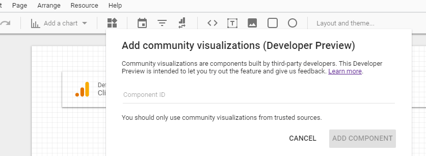
But where do we get this component ID? In Data Studio showcases, the ID is usually given at the bottom left. It always starts with “gs://” followed by a directory path.
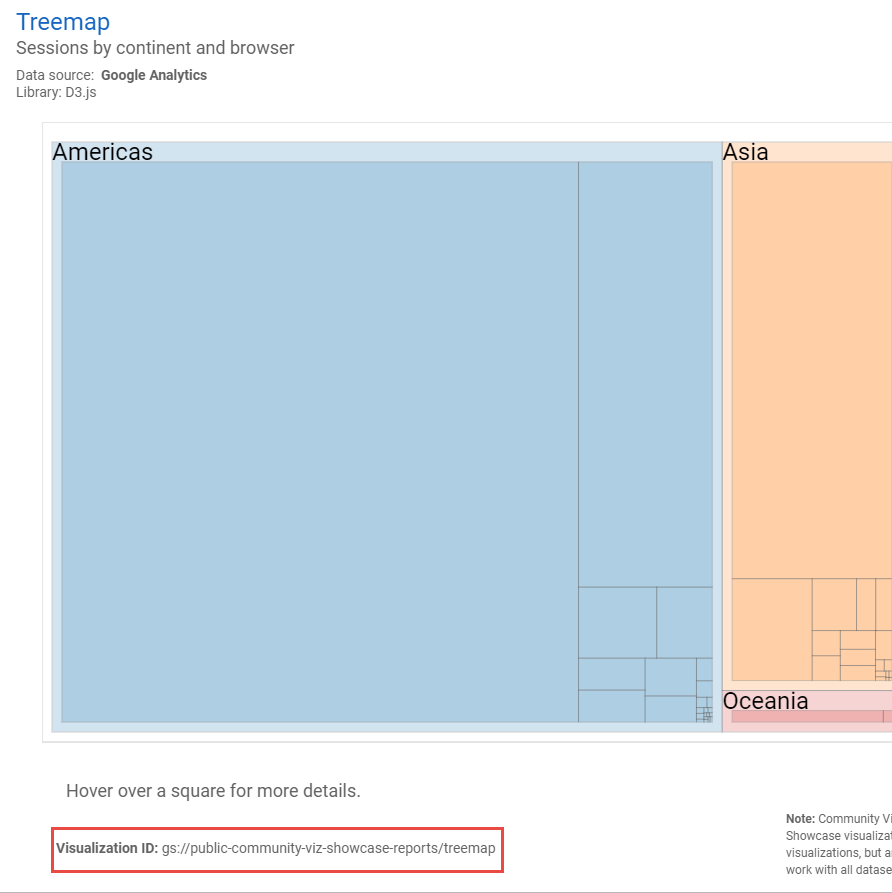
We copy this component ID into the input field that we opened for the Community Visualizations by clicking on the button. Now we can place and customize the chart on the dashboard. But we have to make sure that we…do with the chart what the developer of the chart had in mind. If we use data that is not suitable for this visualization, we will get no result or an absurd result. Here I have e.g. B. uses the treemap to visualize a channel overview:

The Community Visualization used here provides me with settings for the dimension and the area. I chose “Device Category” and “Default Channel Grouping” as dimensions. “Area” corresponds to the metric in the custom visualization “Treemap”. The labeling is not yet visually perfect and could be further adjusted here, but the result still shows what is possible.
Special tip: Read out the component ID
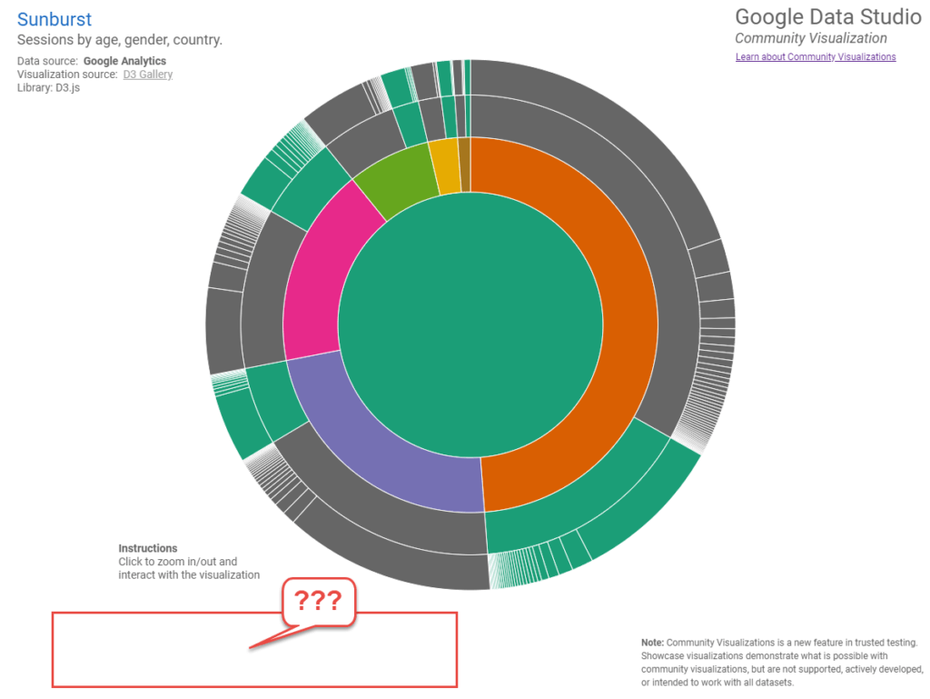
In the course of my research, I repeatedly discovered an interesting community visualization for which no component ID was published. Even some of Data Studio’s showcases themselves (like the really innovative Chart “Sunburst”) this ID was missing.
Also in the community visualizations of variousBlogslike this very pretty oneChannel grouping over timeI searched in vain for the component ID:
In these cases, however, I have a very good chance of getting the ID directly from the chart’s source code. Right click and “examine” opens the developer tools. Using “Ctrl + F” I now search the code in the “Elements” tab for “gs://”.

Et voilá – I already have the component ID, which allows me to use the chart in my own reports. Copy-paste into the input field through which the community visualizations are integrated (see above), and I can then link and adapt this chart to my own data source.
Finally, it should be noted that the Community Visualizations are currently still a developer preview and can be used – but in a productive environment you do so at your own risk.