Usability In E Commerce Stores 8211 Get More Users To Conclude Purchase

Management Summary
Home page
The homepage of your e-commerce platform should contain the following:
- Hero image with current campaign or product range
- Navigation: easy to find, well structured and not overloaded
- Search function: prominently displayed
- Login & Shopping cart icon (if relevant)
- Information about delivery conditions
- Advantages of your platform (Why should a user buy here?)
- Current offers/new products in the range
- Registration for the advantage club or newsletter (if available)
The most important thing is to think about which elements are displayed above the fold. These are the elements that users see immediately after accessing your homepage without scrolling.
Zalando, for example, offers an example of good communication on the homepage. What is striking here is the prominent communication of the delivery conditions and the right of return (USP of Zalando). The big hero shot tidies up the homepage and the categories are kept minimalistic.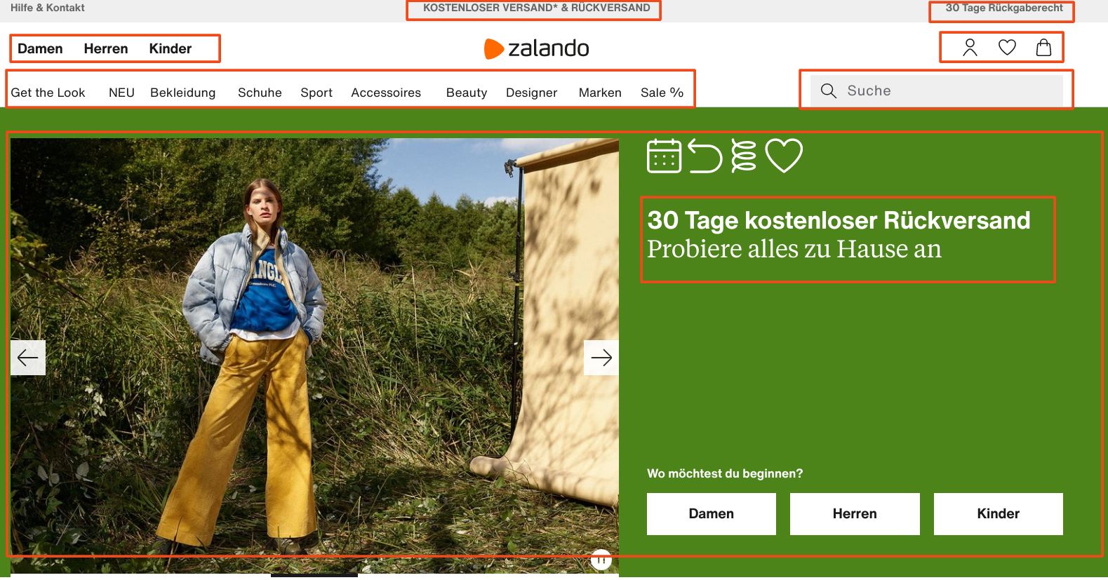
Footer
The need for a well-structured and optimized footer is often underestimated. However, click and scroll maps show that users pay attention to the footer and interact with the footer relatively often during the journey on your website. So use this element to guide users through your site and to create trust.
A footer should contain the following elements:
- Contact information
- Trust elements: Logos of payment service providers or external certifiers
- Quick links to the most clicked product categories
- Legally obligatory information (data protection declaration, legal notice, etc.)
- Quick links to return information, delivery and payment conditions
- Quick link to service FAQs
- Quick link to a description of your company (“About Us”)
Registration for the newsletter can also be placed in the footer. If you put users in oneUsability testingWhen faced with the task of signing up for the newsletter on a site they don’t know, they instinctively scroll down. This means that users have already gotten used to the placement of the newsletter registration in the footer and expect it there. Take advantage of this habit.
We can cite the Obi hardware store as best practice. Obi reiterated the advantages of the platform at the end of the page and relies entirely on trust elements in the footer at the top.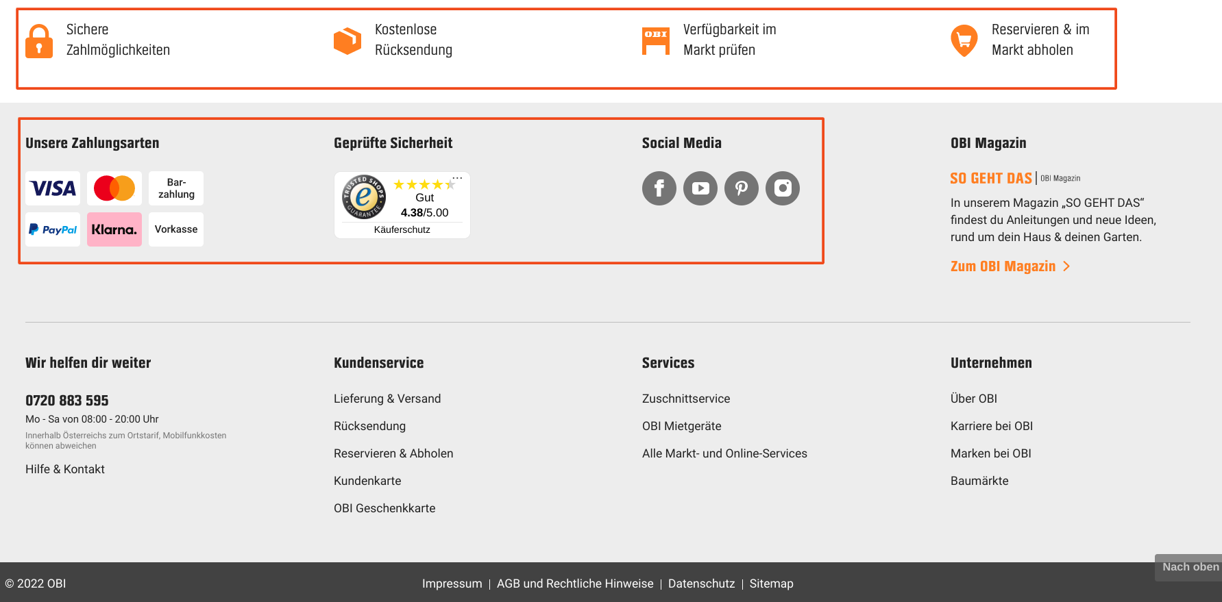
Category page
The category page is used to give users an overview of your products in the selected category. Above all, it serves to make it easier for users to choose a product and to nudge them towards “add2cart”. This is best achieved with disruptors that point out the popularity of a product as well as advantages or discounts.
You should also use images that are as large and clean as possible on your category page. For example, session recordings show that users often scroll through category pages quite quickly. This means that when choosing a product, you primarily base your search on the images. Of course, an optimized headline as well as reviews and short product descriptions should not be missing from your category page.
Amazon illustrates this best by pointing out current offers or Prime benefits on their category pages and marking some products as “Amazon’s Choice”.
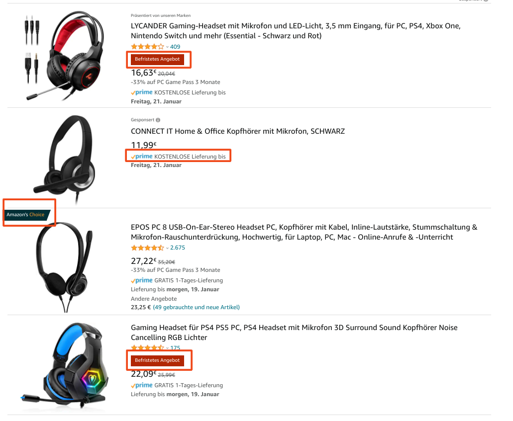
However, the most important element on your category page is the filter. In 2017, psychologists Sheena Iyengar and Mark Lepper“Jam Experiment”demonstrated that consumers exposed to a larger selection of products purchase significantly less than those exposed to a limited selection of products. The filters on your product page allow users to limit the selection of products displayed based on their preferences. Make sure that the filters are easy to use and that the categories correspond to what users want to narrow down. We would be happy to help you with that!
Product page
Click maps in e-commerce stores show that users interact very strongly with the images on product pages. So make sure you place good pack shots on your product pages. Also, show the products from different angles and in use. The better users can get a real picture of the product, the more likely they will decide to buy it.
Your product page should also contain the following elements:
- Product description
- Advantages/USP of the product
- Reviews
- Clear and eye-catching call-to-action (add to cart)
- Further details about the product
- Information about shipping costs, shipping options and duration
- Information about payment terms
- Possibly product recommendations
- Possibly trust elements
H&M offers a good example of a successful product page. Above the fold you can see the product in all variations. H&M provides access to further product details, reviews as well as delivery and payment conditions via a sticky banner.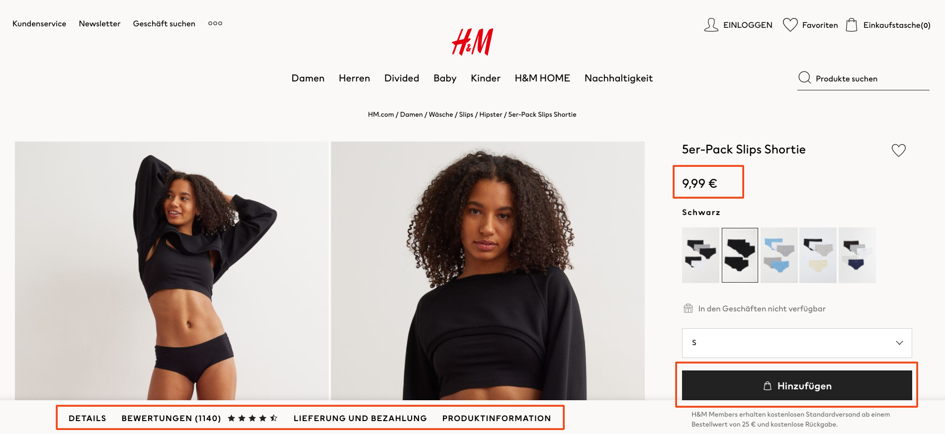
Shopping cart
So far so good – users have added your product to their shopping cart. Unfortunately not, because the shopping cart abandonment rate across all sectors and industries in online retail is currently approximately70%, and mobile even 86%. Optimizing your shopping cart page is therefore essential when it comes to increasing your e-commerce conversion rate. All users want to know how much the order will cost them in total. So communicate exactly that clearly, transparently and well structured on the shopping cart page.
When designing the shopping cart page, pay attention to the following elements:
- Order total: List of all relevant costs
- Selected delivery option, delivery costs and delivery time
- Payment options
- Trust elements/reviews
- Cheering: encouraging the user to checkout (e.g. “Just 3 more steps and you’ll be surfing with high-speed internet”)
- Clear and eye-catching CTA
- Make it easy to adjust the quantity or add/delete products in the shopping cart
We can once again cite Zalando as a best practice shopping cart site. Zalando relies on a clean and structured design of the shopping cart page, whereby all important information about the product as well as the delivery and payment conditions are clearly communicated to the user.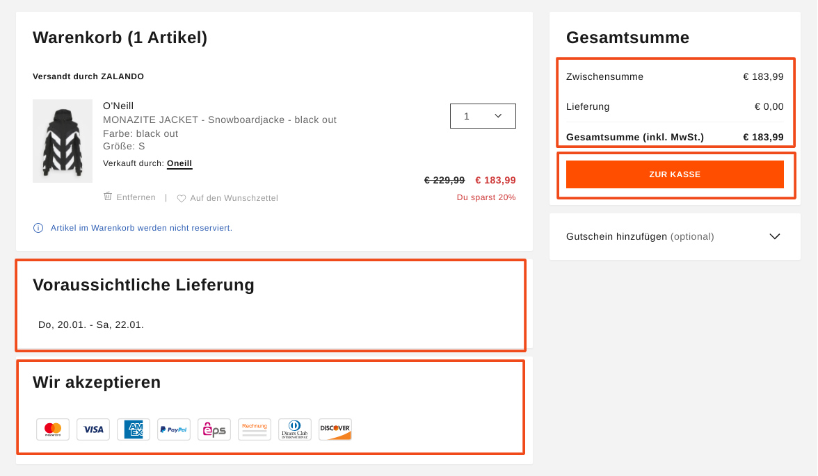
Check out
The biggest hurdle has been overcome: the users have entered your checkout process. Again, not quite right. In general, it can be said: the further users get in the checkout process, the more likely they are to complete the purchase. Typically, you see high bounce rates at the beginning of the checkout or when transitioning from the shopping cart to the checkout process. Nevertheless, users often experience some hurdles during checkout, which can lead to exits at individual checkout steps.
First things first: allow users to complete the transaction as a guest. For most users, there is nothing more annoying than having to go through a long registration process before making a purchase. We also see in click maps and session recordings that users typically have problems when logging in because they don’t have their password ready or enter the user name incorrectly on mobile, etc. So be sure to offer users the option to continue as a guest. After the users have entered their data in the ordering process, you can give them the opportunity to register again using a checkbox. If the user ticks this checkbox, you can dynamically display a field for assigning a password and you have a new registration.
Other points to note during checkout:
- The order total, delivery and payment conditions should be visible to users at every point in the checkout
- Divide the checkout process into several steps and show users which step they are currently in
- Allow easy navigation between steps (back and forth)
- Extract the checkout process so that users are not distracted by navigation or search functions
- Reduce forms to mandatory information: the shorter the form, the more deals
The Swiss mobile phone provider Wingo offers an example of a successful checkout process. The process is broken down into individual steps, with the shopping cart summary visible in each step. What stands out particularly positively is the way Wingo designs the forms in a playful way (for example with the question of salutation) and that the fields are kept short and to the point.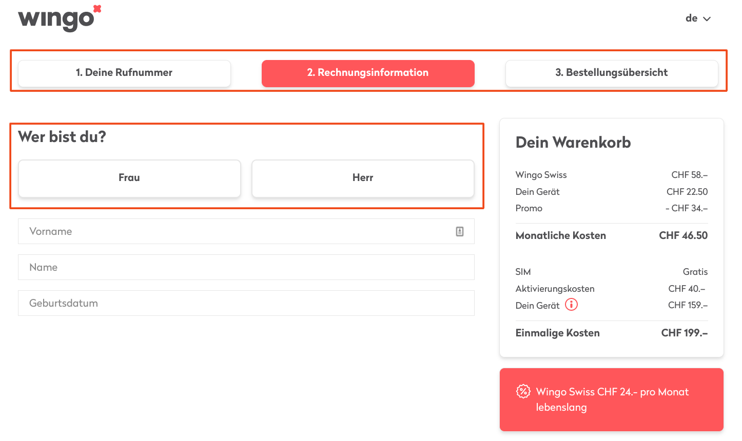
A/B testing
Who decides which elements should be shown first on the homepage, which filter options make sense on the category page, and where the CTA should be placed in the shopping cart? We recommend letting the users decide! WithA/B testingStep by step determine the design of elements on your site that brings the most users to the purchase. This ensures that the user experience of your e-commerce platform is optimally adapted to user behavior.
Do you need help?
We carry out an audit of the user experience in your e-commerce store and develop suggestions for optimization. We carry out usability tests and generate insights that can sustainably improve the user experience on your platform, and we are also happy to advise you on A/B testing. Simply send us a non-binding contact request to:kontakt@e-dialog.group