Data Studio Dashboards Made Interactive With Filters (ex Looker Studio)
Management Summary
UPDATE: Google has renamed Looker Studio back to Data Studio as of April 2026. Similarly, Looker Studio Pro will now be called Data Studio Pro. Don’t be confused by the naming conventions in the text! The information in this article remains valid.
In this blog article we show how the functionality and interactivity of Data Studio (formerly Looker Studio) dashboards can be optimized using filters.
Filters make Looker Studio dashboards interactive
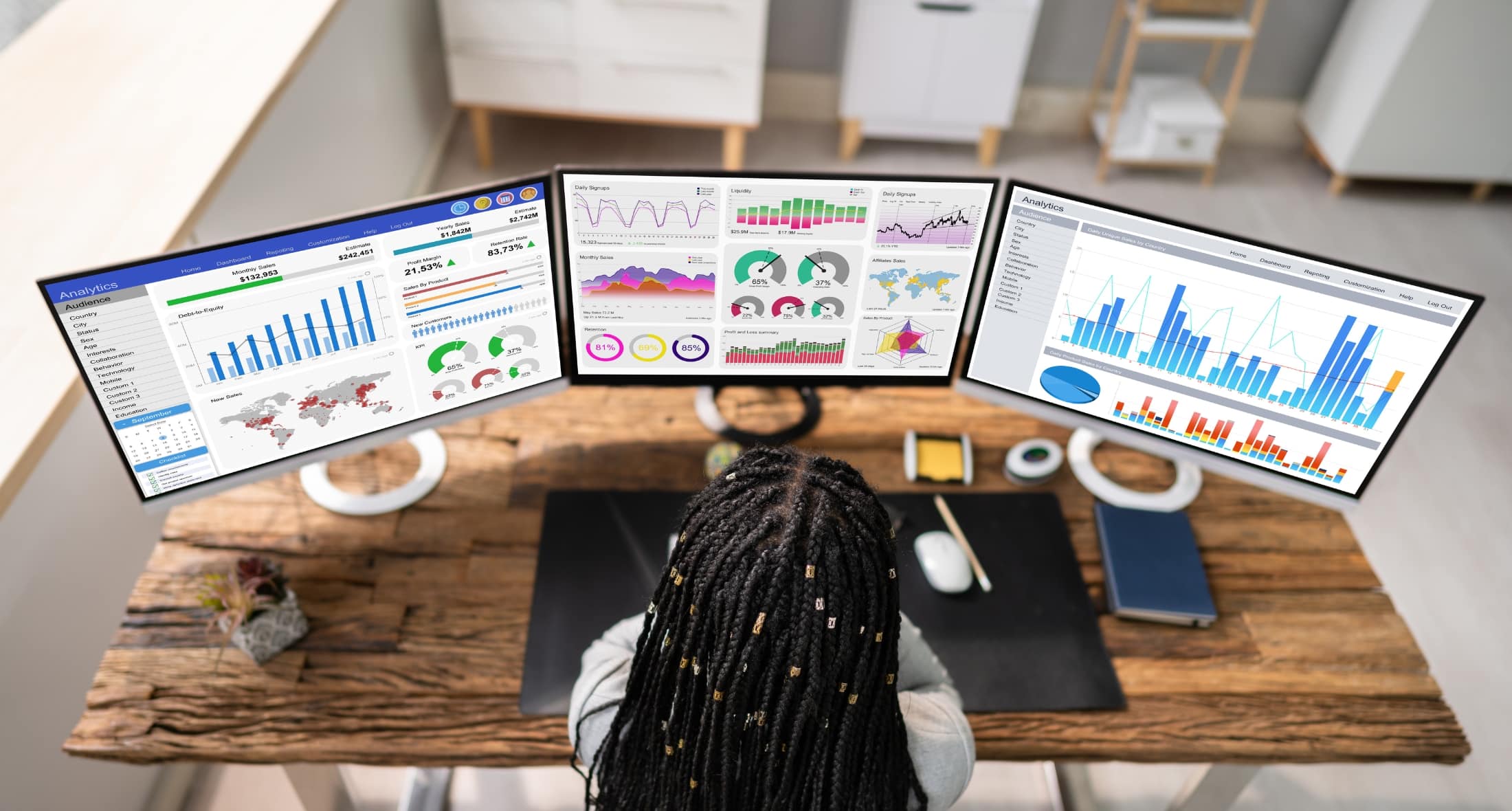
Who doesn’t know that dashboards are created with great effort and are forgotten after a short time because they are not actively used. This can be counteracted by designing the dashboards to be as interactive and self-explanatory as possible. The level of interactivity can be significantly increased with the help of filter functions and controls.
What filter options are available in Looker Studio?
We’re not talking about data filters that are added directly in the respective widget or at the report or page level in edit mode to filter a specific subset of the data. This is more about filters than controls that can be used in reading mode by users who use the dashboard for reports but do not actively edit or create them.
These filter functions can be found under the menu item “Add control” or in English “Add a control”.
Period control
The period control is probably the best known and most frequently used filter in dashboards. This makes it easy to select the period from which the data is displayed in the dashboard.
What the tax option unfortunately cannot do is add a comparison period. This function can only be set per widget in edit mode.
Dropdown filter
As the name suggests, this is a drop-down list where one or more values of a dimension can be selected. In addition, a metric can be stored to show the ranking and the value of the individual entries.
Similar to the dropdown filter is theFixed size list. The only difference is that the list does not open as a dropdown, but is displayed in a fixed size as a block.
Input field and advanced filter
You can search for expressions within a dimension using the Input or Advanced Filter. This is useful, for example, for dimensions that contain longer entries such as campaign names or page paths. With the input filter, the operators such as “contains”, “equals”, “regex”, “starts with” and “in” are permanently stored by the creators; with the advanced filter, people with reading rights can select them themselves in the filter.
Checkbox, slider and preset filter
These controls are not classic filters. In order to use this, it is best to create a parameter in advance. This shows how this works and which use cases can be easily represented with itBlog article.
Data Control
With the “Data Control” element you can easily integrate a field into the dashboard with which the data source can be exchanged. The data source must be of the same type, so for example the data from a different Google Analytics 4 property can be displayed here. This is particularly practical if there are several GA4 properties in the company. The widgets then display the data of the other property with just one click.
This field can be used for data sources from the following tools:
- Google Analytics
- YouTube Analytics
- Google Ads
- Campaign Manager 360
- Search Console
- Google Ad Manager 360
Dimension Control
The Dimension Control is one of the newer and also a very practical feature. Several dimensions can be stored in the filter element here. Users then have the opportunity to easily swap the primary dimension in the widgets using this feature.
How are the filters applied in the dashboard?
The controls and filters mentioned here apply to the data from the same data source across the entire page in a report. However, you can set the filter to be valid for the entire report. This can be done simply by right-clicking on the element and clicking on “Make report-level”. The filter element will then appear in the same place on every page in the report and once the person selects something in the filter, that selection applies to the entire report. This means that when you scroll to the next page, the filter selection remains and does not have to be set up again.
In addition, filter elements can also be grouped with individual widgets. To do this, simply mark the desired widgets and filters and then right-click on “group”. The filter selection then only changes the data in the widgets of the respective group.
If several filters are in use, they can also be used together. The selection made in the first filter element then also filters the selection options in the other filters. For example, it could look like this: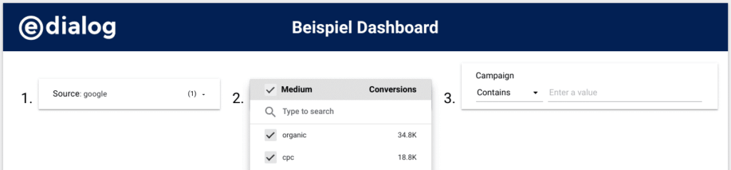 So in the first filter Source “google” was filtered. Therefore, in the second filter we only see the medium values that apply to the source “google”, in this case “organic” and “cpc”. In the third filter you can then filter on a campaign name. Of course, these filters can also be used in a different order. The label with 1-3 is only used to guide the users.
What else there is to consider
To ensure that the filter and control elements are used in the dashboards, the design should be as self-explanatory as possible. Tips for Looker Studio designs can be found in this oneBlog article.
For more complex filters or the possibility of sequences, a textual explanation in the dashboard makes sense. In addition, arrows or other eye-catching elements can be used to point out the interactive features.
Conclusion
When creating dashboards, usability and interactivity as well as the target group should not be forgotten. Dashboards should be used for the long term and not end up in a drawer after a short period of time. Filters and controls help a lot with this.
In particular, dimension control as well as drop-down and advanced filters can improve the user experience and lead to more interaction with the dashboard. However, a design that is as self-explanatory as possible should not be ignored.