Dashboard Excellence: A beginner’s guide

Management Summary
If you’re reading this, you’ve most likely tried to read a dashboard before and had trouble understanding it. Maybe you even felt bad because you weren’t sure if the numbers were for the current month or the last month. Maybe you couldn’t tell if the different shades of gray on a donut chart were one traffic source or the other because they didn’t have enough contrast. Let us reassure you: You’re not alone. The world of digital marketing is littered with dashboards that feel like an obstacle course. In this introductory article on dashboard excellence, I’ll show you how to create better dashboards – from thinking like your dashboard’s target audience to common mistakes, best practices and other tricks.
What exactly is a dashboard?
In one of my first jobs as a data analytics professional, I was asked to create a dashboard to be used by a department that handles customer support via phone calls. Their main goal was to understand how many calls to expect at any given time so they could adjust their capacity on the fly. This was possible by tracking online interactions that resulted in active calls from this area of the business. They wanted to be able to see at a glance on a screen – mounted on the wall – whether they needed to shift the team’s focus or even call IT. The managers at the call center I worked for certainly couldn’t dig through all the web analytics metrics, but they were great at understanding their KPIs.
This quickly taught me what a dashboard shouldn’t be: a dumping ground for every metric you’ve ever tracked. It’s a single, focused canvas that collects related data, provides a clear order, and delivers an “aha” moment within seconds. That last metric, seconds, is important. If users have to stare at puzzling labels, zoom into donut segments or scroll through tabs just to grasp the basics, you haven’t built a dashboard, you’ve built a chore.
Stop confusing reports and dashboards!
Reports and dashboards have different purposes. A report dives deep into a data set and dwells on historical context. A dashboard, on the other hand, blends multiple data sources into a live snapshot and invites interaction through filters and time range controls. Analysts love reports because they can pick up every thread; decision makers love dashboards because they get clarity quickly. Mixing them up sabotages everyone.
The three core dashboard archetypes
Creating a dashboard starts with understanding who will use it. Build the wrong type for the wrong audience, and be sure they’ll lose focus. Build the right type for the right audience, and everyone might get promoted! Most dashboards fall into one of three archetypes:
-
01
Operational dashboards
Operational dashboards act as a command center and track live campaign speed, ad spend or site availability. Like the example with the call center team I mentioned earlier: Does someone need to keep an eye on whether something is broken in real time?
-
02
Strategic dashboards
Strategic dashboards focus on long-term goals and targets (KPIs). Are usually delivered to people who want the answer to “Are we reaching our monthly target?”.
-
03
Analytical dashboards
Analytical dashboards provide a sandbox for power users, allowing them to drill down into reports, use different filters and apply their expertise to dive deep into the data and perform their analysis.
Common dashboard sins (and why they hurt)
Some design flaws are quite common in dashboards. Confusing layouts force users to play hide-and-seek with KPIs, while scrolling buries context off-screen where it might be forgotten. Data bloat – unnecessary decimals, redundant metrics – hurts what’s valuable, and context-free numbers (“Sessions: 12,430”) leave stakeholders guessing whether that number is cause for celebration or panic. An excessive amount of charts is another common sin: Gauges, 3D bars and unnecessary color gradients cause headaches, not insights. Other visual clutter, like drop shadows, icons, rainbow color palettes, adds nothing meaningful and distracts attention from what really matters. Using them sparingly may be fine, but try leaving them out and see if it gets better.
How to get started with Dashboard Excellence
Start every dashboard project with the question, not the data. Stakeholders rarely wake up asking for a “pivot table of everything”; they more often want to know if their spend is driving growth. Design the entire experience from that one question. Next, enforce a clear structure: organize content from left to right and top to bottom, place core KPIs above the fold (visible without scrolling) and hide drill-downs one click away. Conciseness is important: summarize raw numbers into rates, deltas, internal team goals and benchmarks so users can always see “good” or “bad” at a glance, and keep scales consistent. Remember, if a metric is just “nice to have”, it might be better not to include it in the dashboard at all.
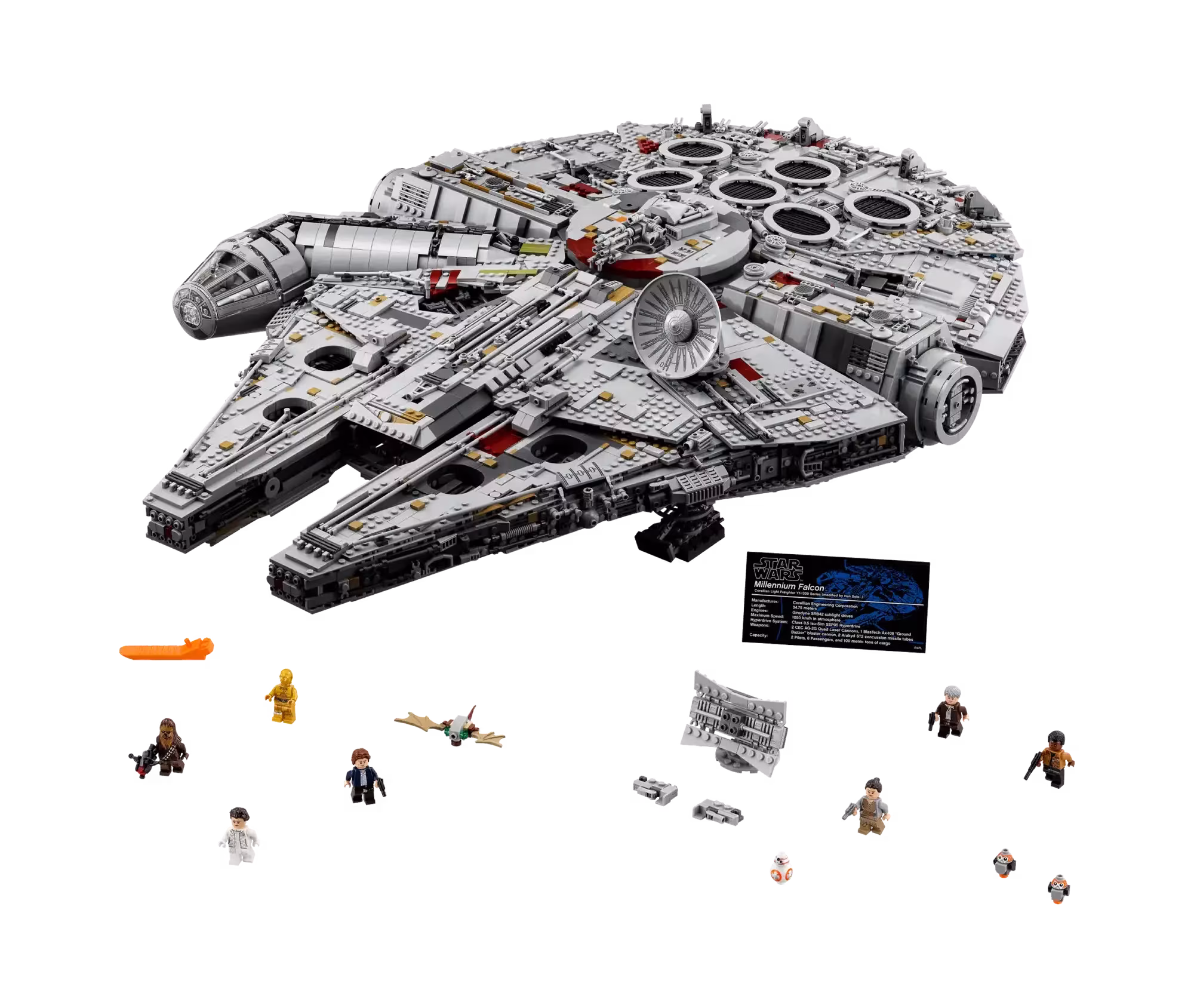
Storytelling then transforms raw metrics into meaning. Data points are Lego bricks; your narrative is the manual that turns them into the Millennium Falcon. Arrange visualizations so that each one answers the next logical “why?” question. It’s much easier to remember what each part of a dashboard is supposed to communicate when correlated visualizations are next to each other.
Image: lego.com
I vividly remember working with a company that insisted on using their color palette meticulously in dashboards. The problem was that it consisted of fifty shades of gray (trust me, not as sexy as it sounds) and red. The whole thing looked like a bugfest. Good design principles reinforce the story you want to tell: use a restrained color palette (about 60% neutral, 30% brand, 10% alarm), choose screen-optimized fonts, and let white space give the elements room to breathe. Finally, iterate without fear. Launch a version one, observe how real users interact with it, and refine. Tools like Power BI, Tableau and Data Studio (formerly Looker Studio) change; human cognition does not. User testing is the fastest way to understand if you’ve been successful.
Tool-agnostic, principle-obsessed
It doesn’t matter if you are using BigQuery in Data Studio, writing DAX in Power BI or iterating a Tableau visualization, the above principles apply. Tools are just vehicles, you are the pilot. You can’t save a confusing dashboard by switching platforms, any more than you can fix a bad book by changing the font – unless maybe you start with Papyrus.
Conclusion
A dashboard deserves the title “excellent” if it reduces the decision time from hours to minutes – ideally seconds. Anything less is noise. Build with purpose, tell a concise story and never force your audience to search for meaning. If you want to see what that looks like in your organization, let’s talk. Creating excellent dashboards that drive growth is one of our specialties.